If you’re in business and you have a little data - ok, a lot of data for many businesses - you may be feeling some fear. It may seemingly be fear from imagining the preparation that is needed with big data.
But more than likely it’s not.
It’s visualizing the data - or more precisely, how to best visualize it to take action.
Data accuracy is important to build trust not only in analytic solutions but in the people who use the reports from those solutions. This means marketers must select report interfaces that control the range, look, and feel of the presented information with respect to organizational needs.
In short, what graphic formats should appear with the data on hand?
Let’s look at a few basic options, with a general eye for war they are good for and what drawbacks can occur.

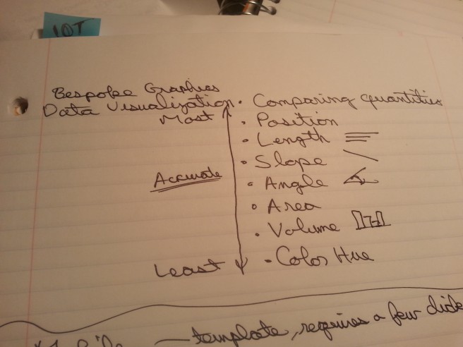
Take note of what makes the best way to display data visually.
Overall, to use data visualization successfully, managers should consider three aspects in selecting a data visualization platform:
- Audience
- Purpose
- What visually works best for the data
The last point sounds subjective, but selecting the right visual graph is really about assessing trends and deviations. What data would you like to see as a trend, and what would provide a useful alert as a deviation? A trend reflects what behavior is developing consistently, while a deviation notes a striking change in a trend. The right graph will help highlight both easily detectable trends and deviations
Spreadsheets Are Better Than Before But Still Have Limitations
Spreadsheets have their value, but they usually offer value for relative small batches of data. As more columns and rows of data are added, the ability to Increasingly difficult to process relationship among the data becomes difficult. Spreadsheets present visuals which only allow for isolating figures. People can't visually register but one or two numbers at a time. This is why many plugins use spreadsheets to highlight a change in value.
Keep in mind, however, that dynamic changes may be harder to spot. Use a bar chart or trend chart to help highlight spikes. But using these in a sheet means data updates have to be timely to make the deviations and trends helpful to business decisions.
Templates can provide a starting point…but in some cases just a starting point
Template solutions can provide a standard starting point for viewing how data should be best displayed. There are a few excellent tools that can visualize data within dashboard options. The most popular tools are usually the self-service BI tools such as Spotfire and Tableau.
There is one drawback with template dashboard solutions: the visualization and concepts are delivered to the user by the solution provider, rather than being custom for certain instances. A template-based data visualization tool assumes a preconceived notion of what data should look like, or what relationships should exist.
Intelligence from data is not always obvious. This means assumptions from a template-based data visualization tool may not reveal intelligence relevant to a business objective.
What Open Source Data Visualization Provides
Where spreadsheets provides a singular representation of data and basic graphs, data visualization based on open source programming can represent active interrelationships that are constantly updated according to real time data input. This arrangement provides faster reporting and faster responses to the reporting results.
Open source programming solutions are increasingly being repented through Javascript frameworks, such as D3 (D3JS.org), a Javascript library designed for data visualization needs.
Business managers should keep in mind, however, that custom build visualization can sometimes involve a development team which can not only build the dashboard but can highlight the organization’s capability of responding to reporting. The good news is that because Javascript is being increasingly used, businesses can leverage its web development team. And in some cases, programming language may not be extensive used, if at all. Overall managers must first access an organization's development capability to build an open source visualization that enhances how an organization functions.
Considering the audience in using data visually is a good idea. Making sure that the audience understands what the data is conveying is important. Doing a mock presentation to a friend would be a good way to see if your data visualization works or not.
Hi Kendall,
I like the idea of a mock presentation, a way to work out some of the questions raised. Sometimes those questions are technical, sometimes the questions are specific context supporting the data. Much of the choice depends on the audience, and conducting a mock presentation helps highlight where to prepare. Thanks for the suggestion.
P